Thursday, March 8, 2018

Web Design ft. CARP

WEB DESIGN ft. CARP


Project Overview

In this project, I revised a whole bland site with an interesting poem. The objective of this project was to notice the difference and impact simple things like font size, family, margin and padding size, and so much can change the overall feel of something and make it more appealing to the eye. Here's a rundown of what exactly I did to give this site transforming makeover!

Contrast

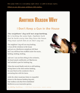
First change that was up was adding more colors to the site, and overall adding contrast. Contrast is a comparison of two or more things that shows a striking difference. The overall results of contrasts help see a new light on a topic, or a new perspective of something. Without contrast, an item can look very dull and bland, and won't have an intriguing impact on its viewer or listener, especially on a website, Everything would look too messy and jumbled together, the audience most likely wouldn't bother trying to decipher or understand what's going on or what the idea is supposed to be. So, to add contrast to this site, I made sure everything was in color; the color scheme being the dog on the right of the poem. Not overusing these colors or add any other out of place colors adds a sense of unity and balance. Contrast isn't only adding color; font size and style counts! Bigger and bolder fonts are the first things eyes will go to because they sense that the bigger and bolder fonts are more important to the smaller ones. This also separates titles from the text body, and headings from captions. It puts everything in order, and helps the viewer flow through everything like a breeze.


Alignment

Alignment is very, very, VERY important! It's the same to contrast in the way that everything can look jumbled and gross if everything is the same. Having the picture, title, poem, EVERYTHING aligned to the left once again makes important things look not important, and doesn't let the full message send through. It's simply not appealing, and looks sloppy. So, having the poem be left aligned, the picture of the dog on the right, and the Title in the center makes everything look pristine.


Repetition

Repetition is the act of repeating something that was already done previously. For instance, For instance, For instance; catch my drift? Adding repetition, when done in a certain way, can help adding unity. In this project, I repeated the font family Georgia, and the colors of important text that I want future viewers to notice.

Proximity

According to the handy dandy website google, proximity is the relationship of the nearness of space of time. In this project, I incorporated proximity through changing the size of the margins and padding. This helps add to the piece because it groups the important stuff together and makes certain text the centerpiece.


Conclusion 

Overall, through constant trial and error, I loved this project! I've always been intrigued over how much effort it takes to make and design websites, so really being in front of the screen and attempting to redesign a bland site was super super fun! Of course, I had Mrs. Zimmerli and my friends to help me through my brain farting moments, which did speed up the process. I know that I will take a lot from this project, especially in the future! :)

Monday, March 5, 2018

Point A to Point B Project Analysis


    1. This project was extraordinarily fun to be a part of! It was the first project where I could be behind the camera and kind of direct the production as it went on. I also got quicker at editing (though my computer wasn't cooperating; what's new). So, lets start at the beginning. Me, Jaden, Julia, and Nandini quickly assigned each other our roles; I was the cameraman, Julia was the director, Jaden was the art/location finder, and Nandini was the actress. With this indestructible team, the whole project would be a breeze, right? Well, wrong in a way. Even though I was in a bomb team, trying to battle against 
      lighting and passerby's was exhausting and a tad infuriating. Also, figuring out how to use the tripod on my own was T-R-I-C-K-Y. It took me a while to make sure that my camera wasn't slanted and that it was on correctly. Once I started to get the gist of using the tripod, I started to pay more attention to the types of shots I was taking and how well they would transition in the future when I edited my clips in Premiere. Once we were done filming, we ran back and entered stage 3: the editing process. Maaaaan oh man, slicing chunks of what I thought were valuable pieces to the story was saddening. But it had to be done. I thought doing a 60 second project would be easier. It. Isn't. Finding the perfect song to go with the film was also a long journey. But, after alllll of that, I am very pleased with each and every outcome of it. My team did a really good job, and we were always hustling. I'm proud of my team :)))!!!!!

Tuesday, February 27, 2018

My Personality Type


My Personality Type 

I think the personality type I was assigned is near perfect. I for sure believe that I get my energy through social interactions, rather than munching on chips alone on my spine breaking couch. And, even though I do think many things through, I am way more of an intuitive person than one who believes that every little thing in life has to be planned out and has a specific reason for existing. Also, I trust my gut feeling more than I do anything else. Oh, and I definitely am not a judgmental person 24/7. I perceive before coming up with my final thoughts about something someone. 
I do think that my personality description helps me grasp onto a better understanding about why I do specific things or feel more than others do, and get a rush when I get to hang out with my friends. Knowing that I'm an ENFP also makes the specific occupations I gravitate to so much clearer. There are so many things I'd love to do n the future, like being a professor, singer, actress, author, traveler, and so much more. I also lean towards jobs where I can constantly be around people and be an adventurer. Thinking about me working a desk job and barely talking sounds like torture. 
I feel that when I'm assigned a role that matches up up with my personality type I work waaaay better. Of course, being an ENFP means that I can adapt to anything (which is true), but I still associate with leader type roles over one where I have to constantly be the quiet and take on every little task I believe won't benefit my team. I fancy being able to lead, but also listening to what each and every member thinks and would like to do. 
There are many people in the world that low-key make me want to ram my head into a wall constantly because I just don't agree with the way they function or our interactions are too negative/cringey for me to handle. Like introverted people whodunit even TRY to communicate their thoughts to you, or contribute anything at all. I mean, I understand that they're introverted and that's why they probably don't try as much, but it still hurts my soul. Oh, I ESPECIALLY despise very "sophisticated" people that act like their 1023919409374023947 ranks above you on the little social caste they created in their head. Also, people that need each and every little thing to be planned out, are afraid of change, and/or never listen. All these kinds of people rustle my jimmies. 
To be honest, I didn't learn tooo much because I knew my personality type prior to taking the test again in class. But, taking the test for the bajillionth time does reaffirm my constantly energetic mood and vibes that I radiate off.  

FUN FACT: I have the same personality type as Walt Disney, Dr. Suess, and Robin Williams! :)

Lion/Otter/Beaver/Golden Retriever

My results for the Lion/Otter/Beaver/Golden Retriever exercise weren't really surprising. Turns out that I am 50% Lion and 50% Otter, which is pretty cool in its own way. Guess you could say that I'm a Lotter! Though I'm not surprised with my outcome, I am pleased with it. I certainly do love leading like a lion, and being a happy-go-lucky figure like an otter.

Sunday, February 4, 2018

How to Print Project

How to Print Project


The creative process for this project was rather quick. Me and Jaden quickly decided who would be the cameraman and the muse. Figuring out the script and storyboarding were also quick processes. As the muse, I didn't really do much aside from doing what I was directed to do.
Though I was pleased with the overall result, there's a lot about the process that I would change. For starters, I now would want to shoot the video in the library rather than the e9 room because the lighting in the later room is kind of iffy (especially because of the yellow tinted light source in the back of the class) and because the environment of the library has much more colors and an overall refreshing feel. Another thing I would change is the perspective of our shots, which I feel lacked much creativity and was just boring in general. Along with that, I would like to get more focused shots of myself, because in some scenes the focal point wasn't actually me (i.e the scene where I'm on the very left and Jaidyn in the the right and closer to the camera and not as blurred out as me. Though our camera work was poor and wobbly at times, I'm giving me and Jaden a slide because our tripod wasn't cooperating with us. Though there were many faults within this piece, there were many aspects that I liked. For instance, me and Jaden were in a room where we had to fight against the light sources so that at least most scenes would have the same tint of color. Also, we got our story across.
Some experiences that I would draw from to enhance my next project is the whole editing process and shooting process. Through these procedures, I learned what to do to make future shots more stable and smooth, how to battle unkind light sources, how to edit out some errors, how to add more flavor to certain shots, and how to tell your story through perspective. Overall, I thought that this project was very informative and fun! I learned a lot and can't wait to make my future projects even better!


Friday, December 15, 2017

Making A Website


Process and Overview

The process of making a website is very time consuming and takes a lot of patience.  First, make sure that all your documents and projects are in the correct files to make the future a bit more of a breeze. Then, wack open the program Dreamweaver and have at it! Insert your elevator pitch to wow the crowd, add in a picture that complements the vibes and aura of your pitch and general theme of the website, add in all of your projects, then, if you desire, change the font sizes and types and colors. Make sure that your links work, and you're done!

What I Learned

 I learned how important it is to follow each and every step and that it must be executed correctly. If there is even the slightest mistake, then your aesthetic and flow for your website will be in shambles. So, take your time, and have some fun with it! Try to make your website radiate the essence of you, but don't make it to informal to the point where your site looks like a website 9 year olds play online Barbie dating games. Make sure that it's appealing to all generations, and most importantly, you!

My General Response

Before I get into my response to this final, I would like to get something off my chest; My computer hates me. It feels as if it take a million years just so my Mac cooperates with me and does what I want. Believe it or not, it's kind of difficult to compromise with an intimate object. All of that aside though, I'm beyond thrilled that I know how to make my own website! Mr. Olson's video was very informative and definitely helped me along the way. Well, until next time!

Thursday, October 12, 2017

Color Schemes of Logos 

The color wheel is actually much more complex and has much more meaning put into it than you might've thought. Within the wheel, there are terms like "analogous" and "complementary" colors.What do these words mean, and why do they exist? Surprisingly enough, these terms can help a business soar; and here's why.

Analogous Colors

Analogous colors are 3 colors that are side by side on the color wheel.

Seventh Generation decided to use the Analogous colors of blue and purple while BP used the colors of green and yellow. It was smart for them to use these colors because 1) BP is a company that helps earth, hence the green and 2) Seventh Generation is a company that makes products for you to do your laundry. When you think of laundry, you think of how fresh and nice your clothes will be. The colors they chose gave off this affect well.

Complementary Colors

Complementary colors are colors that are right across from each other on the color wheel. ex. red and green

The Chili's logo uses the analogous colors of red and green while the Fanta logo uses the analogous colors of orange and blue. I think that Chili's chose their colors because their name is referring to peppers (in this case, red peppers) that includes the little green stem at the top. They then used more of the green to complement the little red pepper apostrophe, which makes this logo design a job well done. I think Fanta used orange and blue because blue gives off a refreshing feel, which most drinks want you to feel, but puts a little pep in your step because of the poppy yet complementary orange.

Warm Colors

Warm colors are the reds, yellows, and oranges on the color wheel that give off a welcoming and fiery affect.
Both the McDonalds and Tostitos logo use the blazing colors of red and yellow. I think McDonalds chose to use these colors because they're simple, yet complex in the sense that it brings you in and makes you feel hungry. That's why many companies use warm colors. I think Tostitos used these colors because it gives off a fun and tasty aura.

Cool Colors

Cool colors are the blues, purples, and greens on the color wheel that tend to give off an icy affect.

It's odd that a restaurant would go for a cooling vibe, but that's just what Taco Bell decided to decided to do. It's unknown why. Twitter, however, is smart for using a simple light blue for their logo. Blues often make you refrain from being drowsy, and makes you feel as if you were lifted.

Monochromatic Colors

Monochromatic colors are all the colors that same the same hue. ex.

Miranda used the monochromatic colors of green while RedTV used the tints of blue.  I think they chose these colors because green and blue are cooler and relaxing colors. Since Miranda is a drink, it was a wise choice to use the colors that they did. As for RedTV, it gives off a calming and peaceful affect.

Triad Colors

Triad colors are colors that are equally spaced out on the color wheel. ex. violet, orange, and green
Burger King chose the triad color scheme of yellow, blue, android while the New Orleans pelicans used the colors of purple, green, and yellow. It was smart of Burger King to use the big three (primary colors) because it will make people crave the food they serve even more. As for the pelicans, their color choice was simply nice to look at and wasn't distracting.