This project was super fun to do! I loved the whole process, from picking out the quotes to figuring out what hue of color to add onto a word. Picking out the quotes was easy at first, but got harder (especially when I had to pick my final four quotes). I wanted my quotes to reflect me in some way. One example is the first quote, "Masterpiece of God". This quote is the meaning behind my name (Yabsira). Another quote that reflected me was "The eyes are useless when the mind is blind." I resonated with this because I strive to live a life full of perspective and wisdom.


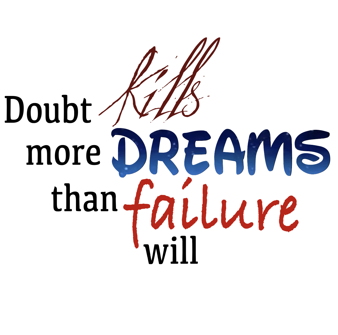
The next step was to choose what fonts to use. This was a tad difficult, because it felt like it took 472834720 different font pages to find what I was looking for. This was especially difficult with this font: "Doubt kills more dreams than failure will." During the production it was also tough figuring out how to arrange the words. Should it be heavier on the vertical or horizontal alignment? Should it be stacked or more free? Should it feel like the words are interacting with each other? I thought about all these questions, and tried to answer them throughout the project.


Working in color was very different than working in black and white because I had to really think of which color correlated with which word. Color is important in the sense that it could change the meaning or tone of a word. Though there was a little bit of stress when working with colors, I did enjoy working in it than I did with black and white because it really helped portray what I was going for and looked less boring/bland. I'm very pleased with how my project came out! Though I think they aren't the best they could be (perhaps because of the lack of framing and graphics), I like the fonts I chose and how it turned out in general.