WEB DESIGN ft. CARP
 Project Overview
In this project, I revised a whole bland site with an interesting poem. The objective of this project was to notice the difference and impact simple things like font size, family, margin and padding size, and so much can change the overall feel of something and make it more appealing to the eye. Here's a rundown of what exactly I did to give this site transforming makeover!Contrast
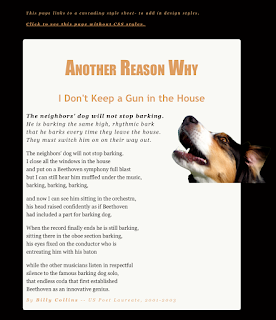
First change that was up was adding more colors to the site, and overall adding contrast. Contrast is a comparison of two or more things that shows a striking difference. The overall results of contrasts help see a new light on a topic, or a new perspective of something. Without contrast, an item can look very dull and bland, and won't have an intriguing impact on its viewer or listener, especially on a website, Everything would look too messy and jumbled together, the audience most likely wouldn't bother trying to decipher or understand what's going on or what the idea is supposed to be. So, to add contrast to this site, I made sure everything was in color; the color scheme being the dog on the right of the poem. Not overusing these colors or add any other out of place colors adds a sense of unity and balance. Contrast isn't only adding color; font size and style counts! Bigger and bolder fonts are the first things eyes will go to because they sense that the bigger and bolder fonts are more important to the smaller ones. This also separates titles from the text body, and headings from captions. It puts everything in order, and helps the viewer flow through everything like a breeze.
Alignment
Alignment is very, very, VERY important! It's the same to contrast in the way that everything can look jumbled and gross if everything is the same. Having the picture, title, poem, EVERYTHING aligned to the left once again makes important things look not important, and doesn't let the full message send through. It's simply not appealing, and looks sloppy. So, having the poem be left aligned, the picture of the dog on the right, and the Title in the center makes everything look pristine.

Repetition
Repetition is the act of repeating something that was already done previously. For instance, For instance, For instance; catch my drift? Adding repetition, when done in a certain way, can help adding unity. In this project, I repeated the font family Georgia, and the colors of important text that I want future viewers to notice.Proximity
According to the handy dandy website google, proximity is the relationship of the nearness of space of time. In this project, I incorporated proximity through changing the size of the margins and padding. This helps add to the piece because it groups the important stuff together and makes certain text the centerpiece.
Conclusion
Overall, through constant trial and error, I loved this project! I've always been intrigued over how much effort it takes to make and design websites, so really being in front of the screen and attempting to redesign a bland site was super super fun! Of course, I had Mrs. Zimmerli and my friends to help me through my brain farting moments, which did speed up the process. I know that I will take a lot from this project, especially in the future! :)